Saturday 21 May 2011

TREE TIME TALES

This is where I'm up to with it, would have liked to have got some colour in there but don't have time now. Does anybody know the details to which we have to send these in? Can we still email them, cause I can't find the address.

Saturday 19 February 2011

Fake Memoirs...

Our latest project based on sequential narratives:


I was asked to make a post showing which tutorials I used in the process of making the panel below: 


(The final panel will be square.)


I started by looking for illustrators who worked digitally so I could make something almost entirely using photoshop. Using Matt Laskowski's epic work as inspiration and his freely available tutorials/resources, I deleted ALL of my brush presets in photoshop, restoring the default ones and adding Laskowski's own set of custom made brushes:


(Link to M. Laskowski's Deviantart where you'll need to download the original file!)

"Now that I have the tools I should learn how to use them the best I possibly can..." 
Reading these tutorials helped me a lot with critical thinking and how not only to improve technique but also make sure that my compositions read clearly for others to see. 'Perspective & Composition Pt. I' helped especially in creating the lines for this panel, analysing the principles behind 1,2 and 3-point perspective and the techniques for drawing them in photoshop and on paper:


'Line art'.


"So, with a new set of brushes and the relevant know-how, I now want to colour or paint my scene! Hmmmm..." 

I did actually wonder how 'painting' was done in photoshop before I read this next tutorial. I've since learned that it's really nothing like the process of actual painting, say with oils for instance. (At this point that it would be useful to have access to some kind of graphics tablet and, if you're any doubt as to which one to buy if you're looking for one, Mr Laskowski has a guide on that too... (Wacom Start-up Guide 2011))
That's about all I have to say, Matt Laskowski has plenty more to say - either go to his website www.plasticshards.com or his Deviantart page/gallery fox-orian.deviantart.com where he has more tutorials and stands as a well respected member of the digital art community. If you're on Deviantart, add him and show the guy some love as he (plus many others) shares all his knowledge with us for free! 


Thanks for looking! ^^

- Kieran


Tuesday 11 January 2011

RX Bandits

Thursday 30 December 2010

Last page in zine.

Not much to say about this, apart from ive really gota start sticking it all together now...

Thursday 23 December 2010

Zine so far


I have finished my digital designs but still tweaking bits here and there, I will be printing it on a4 card, the zine is an 8 paged book, I have reduced the pages, made the designs more simple and used less text to keep a consistency. I have tried to make the use of black and white with hints of purple.
I have also started making designs traditionally experimenting with fine liner, watercolour paints and ink on foam board to see what effect it gives out.

Birminghams got its Hollywood, California, Broadway and now Paris...

My only worry about this piece is if i can get the trees to look more like the Eiffel tower, which of course is possible so i will keep working on this. However i find this to be one the randomest facts ive come up with, but maybe the best?

The next piece i will be working on is the back cover of my book which im not even sure what im going to do with it yet but it is the last thing i do before it all gets thrown together, so maybe i will have time to celebrate Christmas this year.


This will be the front cover of my zine before i was going to go with a very very rough look, but now ive decided to go with something that still looks rough but also looks a little more professional. The odd greay watercolour here and there makes the lettering stand out just that bit more, and i feel the type alone represents my style.

Tuesday 21 December 2010

How to

By any chance chiu could you post a demonstration on how to put our books together on illustrator or in design ect. I know you did a tutorial on it but as you can Imagen there might be people like me who arnt to good on computers doing this project, and without somebody being there to help me through it like the mindless vegetable i am i wont have a clue how to put it together.

Sunday 19 December 2010

Buildings

After adapting and experimenting with different ways to get my message across and what i was actually going to make the book about, ive realised that i will have to adapt a few of my previous designs for my zine, otherwise the designs just wouldn't flow or make any sense.

This piece is going to be one of if not the second page in my book after the title page, which i now have the layout for but im still working on a few points on that. now if you will look at the comparison between this piece and the one before it, that i designed at the start of this project you will see what I mean. 


 As you can see im alot more confident with the lines now and ive got a sence of direction to my work instead of just drawing something badly because i can. 

Friday 17 December 2010

Work in progress


Need to work into black lines. Lots of detail was removed when removing the white from the scanned picture but I think you can see where I'm going with it. Saying that, I'm not too sure that this is an improvement.

Let me know what you think!

Cheers, Brad

Thursday 16 December 2010

Dilemma


Not sure where to go with this image; been working on it for so long I've forgotten where I was planning on going with it. It's meant to be a head swimming through water, leaving a trail of blood as it moves. Grim, I know.

Tuesday 14 December 2010

Has vampires/night creatures been overdone on this project?

I just wanted to ask before I babbled any proper ideas to improve/develop my original fly on the wall idea - all I was thinking about was student nightlife, being practically nocturnal, almost like vampires etc etc and I wanted to make sure it hadn't been run into the ground beforehand.

Feedback would be great, cheers

Sunday 12 December 2010

Pot-holes

To replace one of my pieces that will not be going into my zine, i decided to look at the roads of birmingham and how dangerous they can really be, but of course im exgsaturating it, i decided to find out how manny potholes there are on Birmingham's roads, and also i found a few more weird facts about Birmingham's roads to throw in there as well.

This piece was really challenging for one reason and one reason only, ever since ive been drawing ive never been able to draw a car properly. ><

My honesty

So after Fridays lesson, I was genuinely frightened to upload work. Art isn’t a “right” or “wrong” subject. Art is what is in your heart. This realisation worried me, yet consequently pushed me to remember what I am doing. I have struggled over the past few weeks of this course, no denying that. And it only came to my understanding last week that i’d been repressing these feelings. I realized my inspiration was triggered by people rather than images. 
So, after that insight into my life (that I may regret sharing!) I decided to draw and paint what I love, and what I am thinking about, and what is relevant to me.
I worked on my ideas of trees, which I think are one of the most underrated and beautiful things in nature. They are everywhere, they are unique, and they contain emotion. Some are tall and proud, others are wilting and bashful. Kind of like human beings.


I then looked on a website that Chiu recommended - Illustrationmundo - and found a lovely artist called Yan Nascimbene http://www.yannascimbene.com.
Nascimbene also uses watercolour (like me) to produce simple, effective pieces. I copied two of his pieces, and added my own thoughts to the second piece, to involve text and image. This wasn’t intentional, but a lot of thought was spilling as I was drawing it, so I thought I’d write it down.


I am leaning towards the tree idea for my book, showing different seasons and different moods/emotions of trees.
I have a few more ideas I could potentially expand on, which I need to wrap up and actually get some pieces done!
More to come soon...


Saturday 11 December 2010

Update after tutorial

After my tutorial i realised theres a few things that ive gota change such as, ive been making this book mainly about MY problems with birmingham and whos going to read that and here me yak on about my problems for 8 pages, so now ive started adding a few weird facts about birmingham followed with a design about that fact. Also a change in title name had to be in order if im changing what the books going to be about so no the book is going to be called "Birmingham through my eyes".

Anyway i thought i might as well upload my latest design too.

Wednesday 8 December 2010

What is Comparative Research?

It's a simple but multi-faceted device.

In order to appreciate great concepts and inspiring designs you need to search and find examples that usually fit into specific problems/challenges that you have in a brief.

By looking at how other illustrators/artists work with zines/artists book formats you can begin to compare your strengths and weaknesses, and more importantly identify what it is you need to work on.

It could be things that deal with the idea itself, or the design aesthetic, or both:

a collection
a journey
a sense of contradictions in what's written to what's drawn
a play with scale and perception
a sequence of mishaps
a bible
a dictionary of what not to do
a shopping list
a set of trump cards
an instructional booklet
a treasure map

Page layouts
Consistency of visual language
Use of limited colour palettes
Combination of text and image
The use of foreground and background
The visual experience of unfolding the pages
The feel of the paper
The awesomeness of the drawn details
The mark making qualites
The sense of emotion of the colours/drawings
The list is Fudging endless

me again....

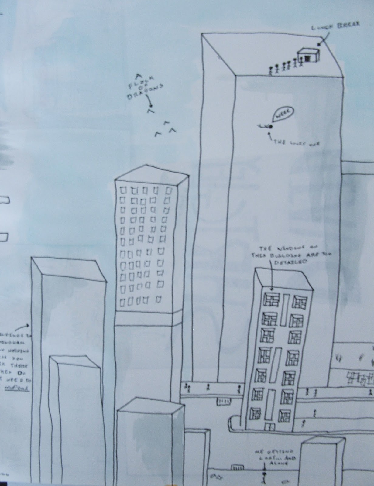
One out of eight of my drawings done. Probably too early to do my final drawings already...but its gna take me a while to do them all. For the other compositions each is going to have a different colour background to liven the book up!

I know this will make me sound like a total idiot.

But I still can't get my head round how to do my comparative zine research.

Is it as simple as it sounds and I just babble on about zines/zine artists that I like the look of or like the techniques they use?
Or is there something more to it that I'm missing?
Help would be greatly appreciated.

Another idea....Who put Bella in the Wych Elm?

One of my colleagues at work just told me about this fab legend - Who put Bella in the Wych Elm?

www.mysteriouspeople.com/bella_in_the_wychekm.htm

As another idea i could potentially gather a few of these legends, and dedicate a double page spread to each one, illustrating the story.

Drawing...


i have decided on the idea of a series of images looking at different legends and phantoms around birmingham, i have given the title 'dead end' as i feel it fits with the whole street sign idea and if you meet one of these mosters you will be sure to meet a dead end. I have an idea for the 8th page to be an image of a set of teeth, with a skull in the centre, so the viewer feels they are being devoured, although im not sure whether to put that image on the back as a fold out poster.

-image of the warstones giant, drawn in biro. ideas are still floating around about the background, perhaps thinking about colour, creating patterns like the scratchy mark making seen in Tommi Musturi's work. Also thinking about including the road sign, or perhaps just lettering 'garguntuan alley'. Suggestions pleaseeee....

Tuesday 7 December 2010

Here I am again.


I thought it would be a pretty good idea if I actually got round to mind-mapping some of the crap that's been floating around in my head, and it's proved quite productive - a couple of new possibilities have come up; I wouldn't say it's finished but I've currently run out of inspiration.

 
After Chiu's comment on my first post I started looking at how the pages might look (very basically) if I chose to run with the fly on the wall art student idea, quite a few things are wrong; perspective, proportion, the character's face etc etc but they were only meant to be quick, shitty test drawings.


These are just a couple of drawings that are linked with a new idea that I've been playing with - the idea of creating a survival guide zine that reads like a wildlife documentary; with the types of people we see everyday in Birmingham transferred into animal for - in this case it's a raccoon Big Issue seller and a penguin police officer (the penguin isn't meant to be so comical - but it kinda accidently turned out that way). The animals used would be some way connected to the impression we have of each type of person. This is another unfinished page as I'm currently a little stuck for inspiration,  but I'm working on it.

Initial Ideas and Sketches

Whilst exploring Digbeth for my typeface research in the last project I was struck with two thoughts. One, Digbeth is a shithole. And two, whilst it is a shithole, the dilapidated industrial buildings and decay are fascinating. Not only visually (for a guy like me who's into that kind of thing), but in the aura of foreboding and mystery they give off. 

So for this project, I want to explore the possibilities of what's in the spaces that we normally never see. What could be inside that crumbling old warehouse? Behind that rusted metal door? Could something other than the expected dwell in these dark places that have long been abandoned?

Initial Ideas


Couple of quick monster related sketches. 


I plan to experiment more with techniques, traditional and digital to find a style appropriate to reflect my theme. Will update again with some more ideas, and drawings.


Ideas AND Drawings


So the first thought that came to mind when thinking about birmingham was litter, so around this idea I started to draw up rough sketches and concepts. After that initial thought I couldn't decide where to go with the concept, that is until I saw A pice of baroquely on the floor. Weird huh? From that I went on with litter and divulged into thinking about health and stuff. So I thought what if the veggie got into an argument with a chocolate wrapper, then maybe a cigaret can join in? I then thought that the brock was a douche the way he spoke to the double decker wrapper and cig so I decided to have him adducted by a pigeon, cus god knows we got a lot of em. The moral I was going for was not jugging others and bragging about being super healthy because, well it doesn't do you much good when a giant bird comes and carries you off.


Jack Turner


How to determine what kind of idea to develop?

Some posters are showing that they can provide a variety of suitable ideas - well where to go from there?

Try to consider these ideas in book format - will they be a collection of drawings/statements? Will they be in sequential order? Will they be mysterious and attract the reader to turn the page? Will they reveal things? But all, some, or other book factors should now be considered, and in that way your ideas can evolve :)