Tuesday, 7 December 2010

Initial Ideas n that...

Idea #1 Once we were briefed on Friday the first thing that came to mind, before all the research, was an idea ive had for a good few years now, it is The Day in the Life of Lighter, so immediately started to jot down my thoughts. (NB: Im sitting in the library as we speak and its packed out man, so im not getting on the scanner any time soon; my sketch book stuff will have to wait for now coz im internetless at home atm).
Yeah so i was thinking about the lighter idea because it would be a good way to introduce all the diverse people and places that are held in Brum. It wouldnt have to be a story either it could just be a series of images following the same lighter from place to place, from person to person.

I've had a look on the web to see if im subconsioucly copying someone who has already done this and there are a few videos on YouTube that people have done but i couldnt see anything going in the direction i had in mind.

Idea # 2 I started looking into stories about Birmingham online, in the news and on blogs and all sorts. There was quite a lot of ghost stories from Brum but most of them sounded like a load of crap, but i did get sucked into this one blog that was about the post code wars and gangs within Brum, mainly the Burgers and the Johnsons.

www.urbandictionary.com/define.php?term=birmingham%20gangs This website opened my eyes to other peoples perceptions of my home town, i read this one guy's blog who basically says that if you're white and on your own in Brum, you will get shanked. So technically - i should be well dead by now. Stupidness. There's also a Birmingham/Bronx reference which really tickled me. So from this i was starting to think about justoposing these perceptions with my own; digging out really frightening quotes about town and then illustrating happy images. Or maybe on page with images of the ghetto on one side, and then bright images on t'other - I dunno it's just a thought.

Idea #3 Another idea that i had was about the Brummie/Black Country accent.

www.dialectdictionary.com/view/letter/black+country/page1/?view=enhanced

"If pigs cud fly the'd mek unlykly burds" poi = pie; point = pint; toy = tie etc etc

I could potentially illustrate the brummy accent - some people from out o' town really struggle to understand my accent sometimes which amuses me no end.

Idea # 4 Another idea i had was about the ledgend, the Birmingham Running Man. He seems to be loosing his mojo in recent years but has been a figure that anyone from Birmingham should know. There used to be a time come rain or shine where he would be running up and down every road in Birmingham. There's even a few facebook page's dedicated to the guy, and some locals have even gone as him for fancy dress parties. Ledgend. He's really mysterious and all through my youth there were so many stories about him, where he came from, where he lives etc - i remember hearing he was sponsored by Nike or Addidas to advertise their gear. He wears EXACTLY the same clothes, the same hat, joggers and trainers, and doesnt speak even when spoken too - i can confirm this because he came into Ladbrokes when i worked there a good 6 years ago and he put on a bet that was incorrect, but we couldnt help him because he just stared blankly at us when we asked him what bet he wanted to place. A friend of mine even followed him in his van down the road and did a David Attenbourgh stylee commentary on the bloke! And when i think about the running man, i think about the NEW running man, he wears tight spandex clothes that hug his oh so buff body and makes running look sooo effortless. I could try and dig out other Birmingham 'ledgends' too.

Idea # 5 On location drawings: i could put together a collection of drawings that were done on location from Birmingham. (Think of Dongyun Lee's on location drawings - www.dongyunlee.com/# )

This is a drawing i did of a factory in Aston - i rek it'd look quite nice using dragpoint.

Artist research:Kozyndan (http://www.kozyndan.com/) - amazing illustrations, i really like the use of cutsy characters and on location illustrations.


Yep, so thoughts pleasy - and i have loads of sketchbook ramblings and illustrations that will back the above up, so i'll add all that once i've got scanner access :)

Initial Ideas

 I began just brain storming different ideas, but my main ideas at the moment is to make a zine of overheard conversations and thoughts of people in Birmingham. So to reveal what these  people spend their time thinking about sort of thing...hoping that I can come out with some amusing results. At the moment my thought is that some pages will be portraits of people and others groups sharing a conversation. Not sure about the front and back pages yet though!  The characters will probably be based the people in Birmingham, but exaggerated/altered again to add humour.
 I looked at a selection of artists - how they work and present their images on the page using collage, pattern and a range of media. Some were more relevant/useful than others.

I experimented with drawing people in a range of ways and media in an attempt to reflect the people of Birmingham. Finding artists to then give me more ideas and inspiration. I like the work of Egon Schiele as it was very gritty and this could reflect the darker side to Birmingham , using more strange characters. Also expeirmenting with more cartoon like characters- exaggerating characteristics to perhaps add to the more amusing aspect.

Moving on to a more realistic approach of drawing portraits I came across David Foldvari who uses very small lines to build up the face, creating tone and depth.

Experimenting with backgrounds and different ways of presenting my work I looked into collage, creating a scene of gossiping old women, using a previosuly overheard conversation (but altered slight).
Also tried creating characters with line drawings, as the size of the zine would perhaps restrict the ability to capture and see the detail on some of my other images. I also experimented with stitch as a form of drawing and then by photocopying the left on threads create patterns and drawing on their own.
I want to also play with print (dry point and monoprint probably), as the ink can create backgrounds and maybe experimenting with colour. My next step is gather the thoughts and conversations I want to use, which I am in the process of doing. I am just playing around with different ideas at the moment.

Ideas!


After leaving on friday i got delayed on getting my hands on the brief to get some artist research done, but come saturday i managed to, the artists work that i liked the most was "Gabriel Campanario" as he uses watercoulor in a messy way straying in and out of the lines alot and the finished product looks very different from any others. He also labels his work but i thought i could use this as an opurtinity to create some toilet humor like i have in the "Lighter?" piece that ive done below.

The idea that ive settled on is "people of birmingham" which at the moment is my title but im not sure if il stick with that or not, and of course its about people
that i come across on my way to uni. such as very weird
people or people that just generally are always having a
bad day and tend to take it out on me. so this books
going to have a lot of toilet humor in it.

Monday, 6 December 2010

Just Some Initial Ideas


I quite like creating monsters/ freaks and twisting shapes, so right away I was looking for a way tell a story that would compliment these themes well. Initially I thought about the creeps and weirdos that roam the streets of Birmingham at night, which quickly changed into thinking about how would would these people react when something even more disturbing and freakish invaded their territory and space, and this new freaks interpretation of these degenerates if it was completely innocent like a child and knew nothing of how they really were (think Lennie from 'Of Mice & Men') and its attempts to unknowingly befriend murderers, dealers, addicts and worse.

After initially thinking about this I did a couple of designs of what this freak among freaks could look like and came up with something quite suitable, and even a name (Mildred Von-Skuntz, the most unattractive name I could come up with) It dressed in very dodgy clothes, as if its only source of fashion advice was the curb crawlers it shuffled up to and harassed at night.
Although this is still my favourite idea, I also thought about what if the Zine followed a young woman throughout her night out and her gradual transformation into the ultimate slagbeast. I also thought about themes of self image, how people view you and how you view yourself (we have all seen them, the gals you see in town and you cant help but wonder how they thought using that much makeup would be a good idea) For a good example check out any episode of 'World's Strictest Parents' on BBC 3.


Initial scribbles.


The first thing I started on was drawings that had been lurking in my head since the intro to this project, I had two ideas to follow these drawings, but one quickly fizzed out since it bored the sh*t out of me.
The idea I began to develop more drawings for was a fly on the wall kinda thing for a student in Birmingham - probably Vis. Comm - but I wanted it to be larger than life and quite obnoxious. Which is where this character appeared from, probably best described as an extention of myself.
I've so far done a couple of pages of drawings of this character, currently working on some more, a brief section of research on artists' books & zines (I plan to make a zine for this project) and just starting some research into a comic strip artist whose characters have inspired mine. 


A close-up of one of the first drawings I did - all nighters and falling asleep on your work is not cool. I've being trying to briefly annotate my drawings as I've gone along; mainly alterations that are needed and notes from ideas.


This was the beginning of another set of drawings that didn't turn out very well (the idea that bored the sh*t out of me) was essentially creating a map or a journey of a bar crawl along Broad Street, each pages working as a separate bar/club - with each image possibly bleeding into the next until the last one is difficult to see (because in reality you'd be wasted).


These were more studies of the character I would want to use in the zine - starting to look at expressions, drawing from other angles and the figure in an environment. I plan to create a mind-map quite soon to develop the content of the zine; places, events, story (if any) and drawing techniques & media, as these are areas that are still a bit blank in my mind.


This is my page on artists' books and zine, reference images are missing at the minute but I'm working on it.

Urban Fox likes Hip-Hop


My starting point basically involved a brainstorm based on my perceptions of Birmingham - The people I know, journies I take, places I know, events that have taken place. Most are bullet pointed but the bus idea became a little narrative. I think crackheads congregate on buses...where are they even going? Well, probably to purchase further crack.


 Initial concepts based on the horse that once lived in a local field. One day we fed it a kiwi fruit. The next day the horse was nowhere to be found and we haven't seen it since. Very basic storyboard ideas/layouts...experimenting with the inclusion of text. Inclusive of photos from the location for possible use as backgrounds after editing.


Continuing the animal theme and furthering character design I doodled Urban Fox, who enjoys bitches, hip-hop music, and gnawing on dead frogs. Originating from the foxes on my street who constantly screech at night, the idea is to create a zine using snapshots from his half-gangsta, half-standard fox lifestyle, culminating in being shot in the face by a toff with a shotgun.


Experimenting with texture/background ideas.

On the next pages there is some initial artist and paper-folding research. Its all in the very early stages so any critisism/suggestions/artists to look at/feedback would be really helpful :)
Machine Concept


Here's my main idea, I only have one drawing as of now.
I've been thinking about a zine that tells a story about a walking machine called Birmingham. I looked at various images of Birmingham for inspiration for things to fill the machine. The picture above is only the first design, the whole look of the ship is inspired by "Howl's Moving Castle".

I want my later drawings to be busy so the viewer has a lot to look out for. I will post quick storyboards and the photos I drew from if necessary. I'm thinking of having the machine crumble towards the end, but I'm welcome to any other suggestions...

ideas + research


this is a art book i found with art by Rob Sacchetto it contains illustrations of zombie celebrity and is a take on them celebrity magazines which feeds off of the publics obsession with the life of the famous..... my zombie tourism idea is similar in concept and could be similar in how it is developed further if i use Birmingham tourism guides as a guide line


i came up with the idea of zombie tourism.... zombies can be a metaphor for consumerism so looking at areas of the city where alot of people are drawn too, comparing people too zombies in a city people call the shopping capital of Europe. i want each page of the zine to be a well known comercial site in birmingham.... these are rough sketches and will experiment with techniques during the week


i wanted to base the project on things i nomally draw so i came up with a few ideas involving creatures


http://www.theunderbellyproject.com/

Quite fitting for the title alone. Keep watch for when the site opens. I've seen preview photos and it looks mega!

Thursday, 2 December 2010

Alexander Ver Huell

http://www.flickr.com/photos/bibliodyssey/2708270583/sizes/o/in/photostream/

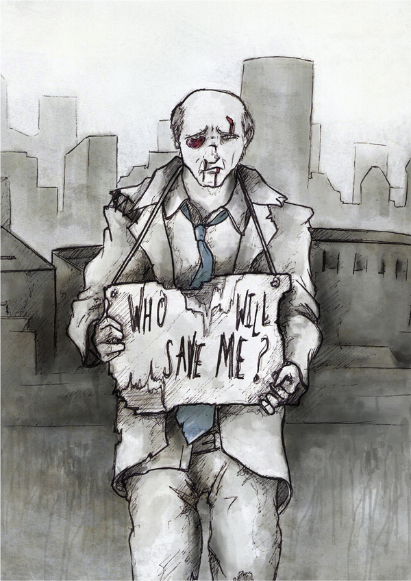
Who Will Save Me...

Leaving the studios last week I was fairly certain of where to direct my focus. Speaking with Chiu, it was obvious some of my images were stronger than the others, what with the use of reference images, better composition, the use of the golden ratio, etc etc etc. Building off this, I collected a lot of reference photos, done some drawings from life and also from the photos to get an idea of the forms. I then thumbnailed (an idea from one to one tutorial) many different compositions for each page. Many of my designs remained the same, or very similar, but the thumbnails did help me to focus on the aspects of each superhero, and better place them in an apt environment.


taking these ideas, i knocked them around for a bit in my RVJ, getting some good compositions and inks sorted. Once they were inked (first image). I tackled the issues of colours.

This is the cover, speaking with peers, the best aspects of it are the subtle colours on the black eye and the tie, combined with the dripping effect bordering the central character. It has also been pointed out that the cover is quite interesting, and makes people want to look through the 'zine simply to see what the cover is referring to, so in that respect it's quite effective.


Taking heart from how good the cover looked, i applied the same approach to the internal pages.

Most of today was spent running around trying different binding methods, trial and erroring with different printers, and so forth. Unfortunately, short of discreetly ramming the inkjets full of cartridge paper, i can't get my cover printed on thicker paper stock as i was hoping, so spent some time trying different approaches and methods, and analysing it in my RVJ. Thankfully this has payed off, and now I know the sizes to print to get a good looking cover which is slightly bigger than the internal pages, and found the best binding method (long armed stapler) to get the most accurate and precise spines.

Wednesday, 1 December 2010

Current Affairs

I've seriously underestimated how long these things take to make! This is where I am now, any suggestions will be very extremely greatly appreciated.


I'm using segments of this for a couple of pages.


This is the drawing for the image of the second page. The caption will be, 'the noisy neighbour', or, 'strange noises next door'.


This is the font style I am going to be using. Decided to go for hand drawn type to compliment messy drawings. Needed some consistency as the drawing style changes on each page.


This won't necessarily be used in this zine. This is just playing around with Photoshop but I liked the results.


After a LOT of measuring and calibrating, finally managed to segment a canvas with guides so Photoshop will work in total harmony with my printer so the zine will fold nicely. THIS HAS TOOK UP MOST OF THE EVENING (unexpectedly). This is where I'm at now. Need a front and back cover and captions on each page. Also, the back page will fold out to a poster which will show the ultimate stage of tiredness in trippy format.

Could anyone suggest paper that will I can print on that the printer ink will not seep through to the other side of the paper so I can print on both sides? I'm just using normal paper and it'll look very messy with images on both sides... it's too thin.

Thanks, BRAD

http://www.blanquet.com

http://www.blanquet.com/marchandises/


So this is where I was last week, feeling pretty sure that this was the idea I was going to use... But then I started drawing some more stuff that I felt was more appropriate.

I did start developing some of the 'future' drawings, but as Chiu pointed out they were all very literal; and the text explaining each image just made it really obvious. I also decided to try and make the humour a little more subtle and bizarre than in this one.


So I started making some weirder, more abstract and surreal images that I thought might express what I was saying in a (slightly) more sophisticated way.


I also had to decide on the drawing style for the zine, I thought it should be fairly consistent throughout but wasn't sure whether to use the very rough, childlike way I seem to draw my idea sketches or a more graphic and clear technique. I decided on the latter because of the more abstract concepts I'm using - the childish, more cartoony look is more effective when the ideas are clear. Anyway, here is the latest draft, in line and colour. Any potential improvements would be welcome...